
Fall Editorial A/B Test
The objective was to test a basic navigation style against the existing blog-like style of displaying shopable content on an in-app page referred to as an “Editorial”. Stakeholders wanted to improve purchase conversion and believed a basic navigation style would drive more users to shop with retail partners.
-
Claudine Zafra, Art Director
Diana Tran, Sr. Designer
User Flow

Encourage customers through a push notification to engage with editorial content that influences their need for purchase and triggers them to click through to our retail partners site and shop with Afterpay i.e. conversion.
The Test

Hypothesis
Version B will perform better because all the content is above the fold. Users will see a birds eye view of products that might entice them immediately. Stakeholders believed this imitates the online shopping experience they’re used to which will trigger subconscious reflexive shopping behavior. Version A is more aesthetic but takes too much effort to scroll through in order to see all the products. Users will not scroll.
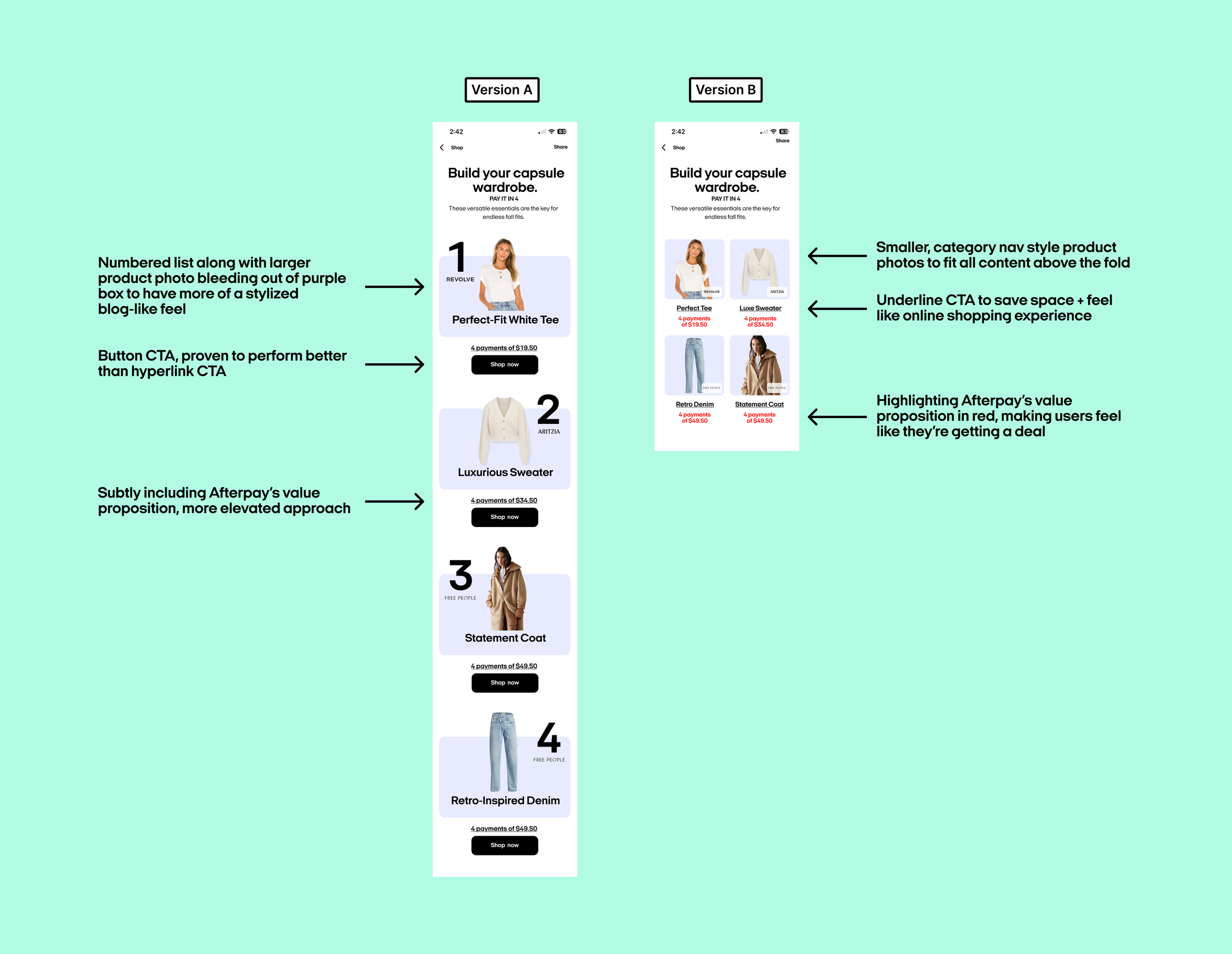
Design Decisions
Learnings
Surprise! Version A Outperforms
Only considering users that clicked through the push notification to open the Editorial. 27% of users that got Version A clicked through to the Retail Partner. Less than 10% of users that got Version B clicked through to the Retail Partner. No data on purchase conversion at retail partner sites were available at the time of test recap.